

Summary
- Robbie Ryan explains the lens search for Poor Things.
- The Zeiss Master Zoom 16.5–110mm became a key tool.
- The 8mm and 10mm provided an exaggerated wide-angle perspective.
- The OpTex 4mm created the circular vignette.
An impossible zoom, dozens of lens tests and an ultra-wide 4mm optic: cinematographer Robbie Ryan explains how the distinctive look of Yorgos Lanthimos’ Poor Things came together.
In a Variety interview, Ryan recalls testing roughly 40–50 lenses in a single day, searching for optics that could make Bella Baxter’s world feel distorted and dreamlike. These were not merely decorative choices: changes in framing and perspective became part of the storytelling.
The impossible zoom and the Zeiss Master Zoom 16.5–110mm
Lanthimos wanted a zoom that could move from an extremely wide view to a very tight frame. In this particular clip, Ryan describes the desired range as approximately 12–150mm — an option that did not exist as a suitable cinema zoom for the production.
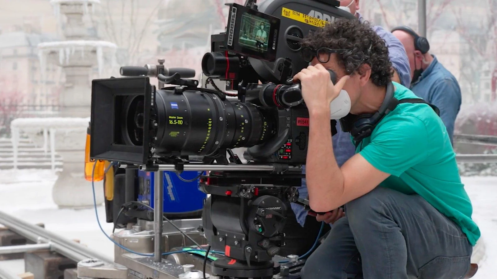
The team settled on the large ARRI/Zeiss Master Zoom 16.5–110mm T2.6. Although it could not reach as wide as the director originally imagined, it allowed the framing to evolve continuously within a shot. Active zoom moves were combined with camera blocking and actor movement, rather than serving merely as a convenient way to change shot size.
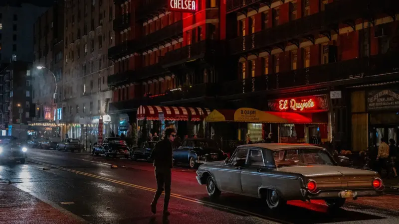
The behind-the-scenes photograph shows just how substantial the Master Zoom is when mounted on a cinema camera. Its size and handling demands were a trade-off for the visual continuity the director wanted.
The 8mm and 10mm carried over from The Favourite
Ryan and Lanthimos also returned to the unusually wide lenses used on The Favourite: an 8mm Oppenheimer/Nikkor and a 10mm ARRI/Zeiss Ultra Prime. These lenses exaggerate perspective, placing the characters within the film’s vast and meticulously designed environments.
Poor Things did not rely on a single optical style. For more intimate framing, the filmmakers also used 58mm and 85mm Petzval lenses, prized for their distinctive swirling bokeh.
The 4mm lens that opened a portal
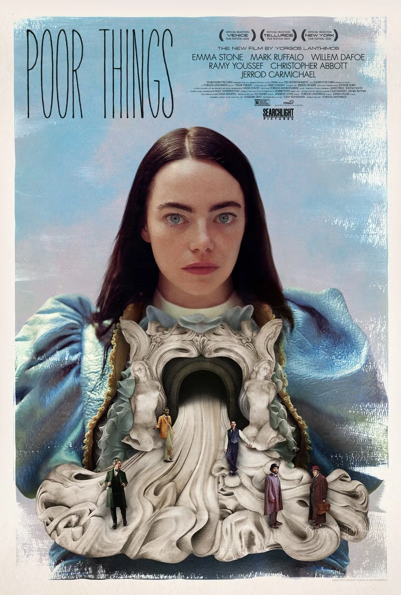
To create the distinctive dark circular border, the team mounted an OpTex Super Cine 4mm lens designed for Super 16 onto a 35mm motion-picture camera. Because its image circle did not cover the larger film frame, it created heavy natural vignetting — as though the audience were looking into another world through a round opening.
This was an optical effect captured in-camera, not simply a digital vignette added later. Mounting the lens also required mechanical modification to make it compatible with the Arricam ST.
What we think
The most interesting part is their willingness to test dozens of lenses until they found what served the story. Lanthimos was not seeking the technically “best” lens. He wanted the image to behave in a particular way, even if that meant distortion, softer edges or dramatic vignetting.
For filmmakers, there is a practical lesson here: focal length changes how we experience space and character relationships. A zoom performed during a take communicates something different from cutting to a close-up. And using a lens that does not fully cover the frame can be a deliberate creative decision rather than a mistake.
That same interest in format and framing is visible in Lanthimos’ film-shot Squarespace commercial. Across different productions, a consistent idea emerges: the character of the image is defined on set, not left entirely to post-production.